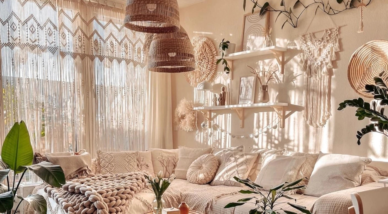
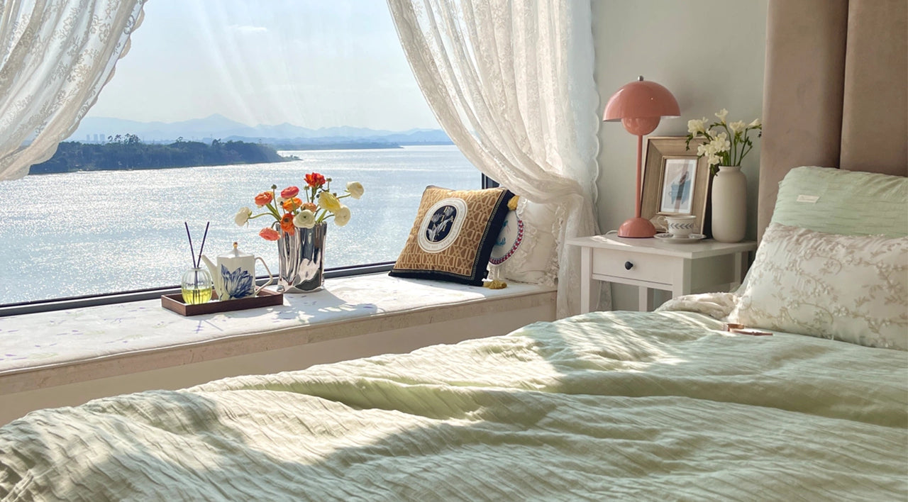
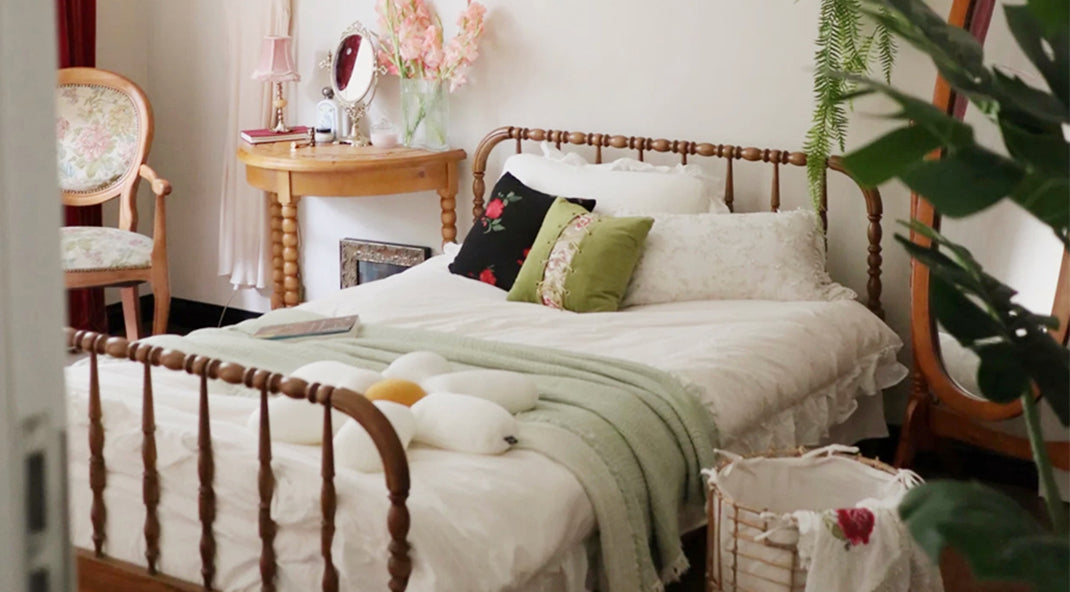
For any bedding, the design elements are composed of styles, colors, patterns and materials. In bedding design, it is required to arrange the elements artistically and scientifically, and more attention needs to be paid to the interspersing and combinations of each element. This is both manifested in single bedding items and between those making up bedding sets.
Color Design Methods
The rich color of bedding is an essential factor that regulates people’s psychological emotions. It can directly affect the style of the interior space and bring people different feelings. The color design of bedding can organically bring various bedding items together. There are many color design methods for bedding, such as the same pattern in different hues and purity, different patterns in the same hue and purity, tone on tone color matching, contrasting colors, etc. The bedding color should not be too sophisticated but need to be changed and matched based on the basic color palette to obtain a unified but varied decorative effect. Color is the soul in the design of bedding, which showcases people’s moods and ideas and is closely related to people’s daily life. Therefore, in the overall bedding design, color design is one of the crucial elements that cannot be ignored. The design methods are summarized as follows.
1. Basic Color Palette

When setting the color environment for bedding, the harmony of colors is often emphasized. Harmonious colors can bring a sense of order and integrity to the living space and create atmosphere and sentiment. However, many objects with various shapes in the same room are challenging to unify. If they can get unified through a specific color palette, better harmony can be achieved.
2. Dominant Color

For multiple beddings in a particular space, you can pick the color of the bedding piece occupying the central area as the dominant color so that the overall bedding color palette will be harmonious, unified, but not too monotonous. Then keep the leading color tone unchanged under the principle of “seeking common ground while reserving small differences.” For large bedding pieces, other bedding items can join to adjust the color brightness and purity. In contrast, small bedding such as throw pillows can adopt similar colors or contrasting colors to enhance or enrich the dominant color.
3. Color Contrast

Both the unity and the contrast of colors are indispensable in interior space. Unity without color contrast tends to look too simple and boring. On the other hand, small pieces with contrasting colors interspersed in the bedding of a unified color palette will warm up the atmosphere. If the patterns and shapes of the bedding are relatively simple, high contrast colors can help get rid of monotony and simplicity.
4. Variation Based on Fixed Color Palette

On the premise that different bedding pieces share the same color combination, appropriate changes can be made to the patterns and color areas. Let’s take the color combination of brown, white as an example. The whole piece of bedsheet and two matching pillows are designed into brown, which appears as a half round spot on another throw pillow. The blanket and a square pillow both use black and white colors, and white is also the dominant color of another pillow. As is seen that the pattern designs vary on different items, but the colors interweave closely with each other, eventually achieving the overall unity.


Comments
I love everything pink, so I got pure pink beddings. Look sweet.
I like to use high contrast colors to create visual differences, and it’s great to look at.
The dominant color in my bedroom is white, but I add several vibrant throw pillows for some bright colors.